App-wide Universal Search Feature of Zhihu Android
This project aimed to increase search function for high traffic pages. We used AB Test, Data analysis and so forth find the better solution which increased the search volume by about three million per day.
Time: Apr. 2017 ~ Jun.2017
Role : UX/UI Designer
Clinet: Zhihu
Background
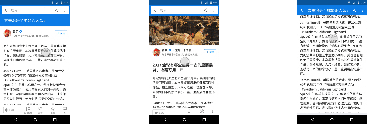
This is my intern project in 2017 at Zhihu. Zhihu, a Chinese equivalent of Quora, is gradually becoming a big search platform where people share and find knowledge and their view of the world. Hundreds of millions of search behaviors occur here every day, however only on the feed page. Our Design Goal for this project is: Provide search capabilities on high traffic pages to increase search volume and boost conversion rates.
Problem Definition

Train of Thought
Search bars or search icons?
Search bar. A search bar is more indicative than a search icon. Since we want to increase search volume, the search bar is better.
Do all search bars need an icon?
No. In the secondary pages, users can be guided by placeholders and search bar since there are three icons already.
How to solve the conflict problem between title and search bar?
There will be a title in the content, and after slid down, the title will show up in the placeholder.
Irrelevant shortcuts in the search bar?
Yes. The logic of the entrance seems to cause misunderstanding, but in fact, the message is more dependent on the meaning of the icon.
How to protect the experience of "where am I" and how to know what page is current pages?
We certainly want to protect this experience, but this experience does not rely on the page title. Take the Discovery Page for example, it is not important whether this page dominantly display the title “Discovery”, what really matters is the contents of this page (hot information, hot topics, and hot content), as they are the keys to defining this page and the reason why users repeatedly come to this page. In addition, the current discovery icon at the bottom bar is expressive enough.
However, the experience of “where am I” is awful in the online version of the discover page: App bar and bottom bar are hidden while scrolling and the style of the page are the same as the feed page. So we also want to take this opportunity to fix these issues in one go.
Initial Designs

AB Test

Plan A looks better than Plan B, but we are concerned that users will make mistakes. We also need to verify the amount of search, so we use AB Test. I designed a few buried points to see user behavior. In order to reduce the impression of the test on the user, we make a Grey release, in which we randomly selected 20% of the users to test the two Plans.
After one month of data collecting, the result is quite surprising! It shows that there is no difference between the click rate of the function icons, but the search volume has a significant difference among the three versions. With three million growth of the Search Volume. Great victory for Plan A!
Iteration
In the same time as the AB test, I consciously checked User Feedbacks. I found that some of the feedback about the search function was about the "Tap the title goes back to the top" experience. So in the next iteration, I added this experience back and made some small interaction adjustments based on the user feedback.

Interface
When the user slides out of the first screen, the Article or Question title becomes the placeholder.
After the update, when the user uses for the first time in Article or Answer page, there will be a bubble reminding the user Click the title back to the top.
Click on the title back to the top and click on the title to return to the answer list.